Project | Design Food Order Card With The Help Of HTML And CSS
 |
Food order card
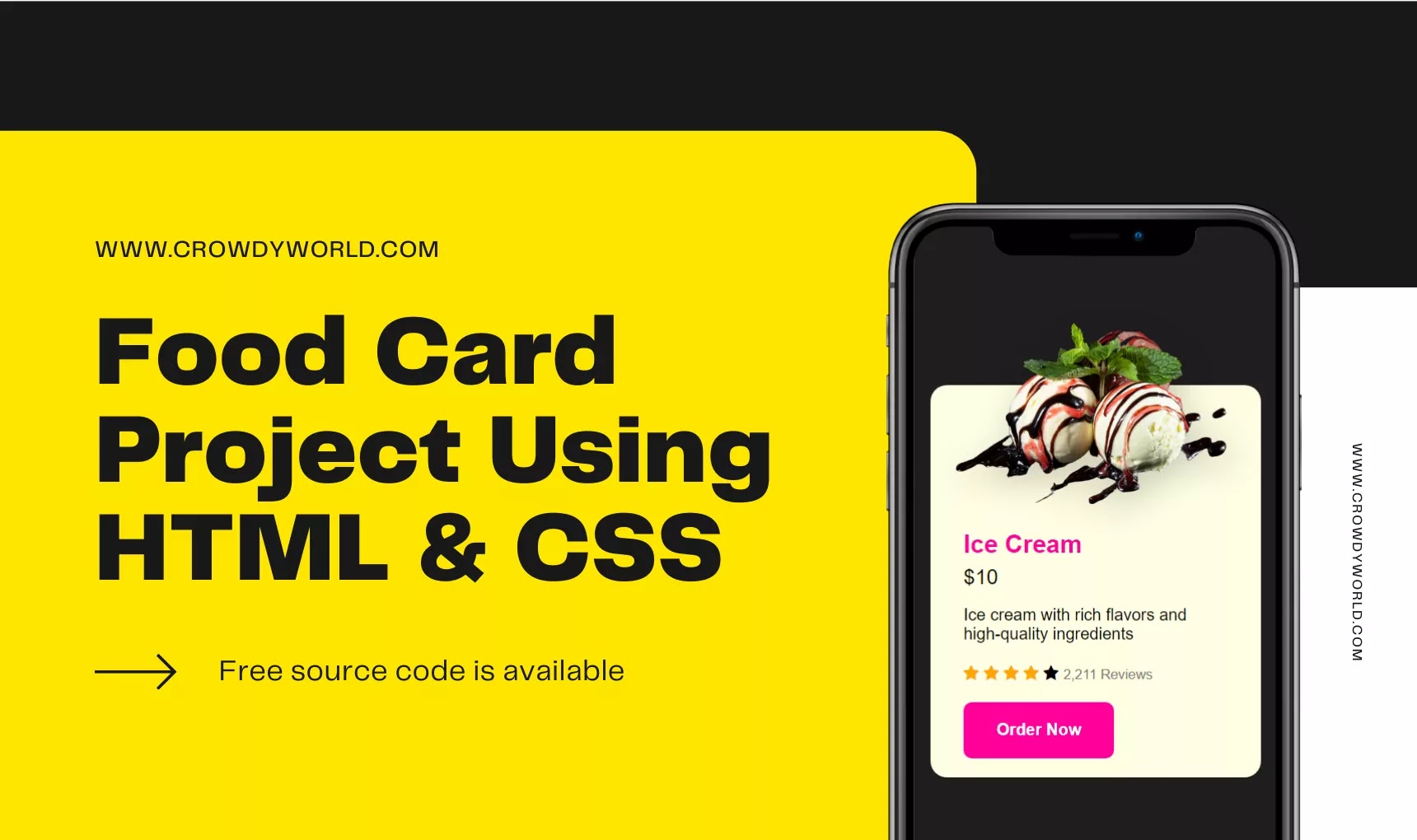
Here in this tutorial, I am going to design a food order card for the cafe or restaurant online application. All code is provided below, this session can be followed by any novice programmer who wishes to learn basic CSS and HTML.
I have used:
- Visual Studio code editor
- HTML5
- CSS3
HTML Code:
In this HTML code, I have used different classes in the main class called "container". Here I am using an image of ice cream but you can use any from the internet to make your food card beautiful. Firstly, create a file named index.html to write all HTML code in it.
<!DOCTYPE html>
<html lang="en">

<head>
    <meta charset="UTF-8">
    <meta http-equiv="X-UA-Compatible" content="IE=edge">
    <meta name="viewport" content="width=device-width, initial-scale=1.0">
    <title>Food card</title>
    <link rel="stylesheet" href="https://cdnjs.cloudflare.com/ajax/libs/font-awesome/4.7.0/css/font-awesome.min.css">
</head>

<body>
    <div class="container">
        <div class="card">
            <img src="icecream.png" alt="Ice cream Image" class="image">
            <div class="data">
                <h1 class="title">Ice Cream</h1>
                <span class="price">$10</span>
                <p class="description">
                    Ice cream with rich flavors and high-quality ingredients
                </p>
                <span class="fa fa-star checked"></span>
                <span class="fa fa-star checked"></span>
                <span class="fa fa-star checked"></span>
                <span class="fa fa-star checked"></span>
                <span class="fa fa-star"></span>
                <a href="https://www.crowdyworld.com/" class="review" target="_blank"><small>2,211 Reviews</small></a>
                <div>
                    <a href="https://www.crowdyworld.com/" class="button" target="_blank">Order Now</a>
                </div>
            </div>
        </div>
    </div>
</body>

</html>
You can use any type of code editor even notepad++ is a better choice for beginners. You can add some additional features such as add more items, recommendation items and many more on your own.
CSS Code:
CSS is the programming language for describing the presentation of Web pages, including colour, font, layout etc. HTML code provides structure only but CSS is used to provide a responsive presentation of the particular web page. It allows one to adapt the display of different types of devices, such as mobile screens, tablet screens, or even printers.
I have used different classes in HTML in order to clarify CSS properties like card, image, button etc in an understandable way. You can change colour and font size of your choice.
Credit: Instagram @coding_gyan_
      * {
            box-sizing: border-box;
            font-family: 'poppins', sans-serif;
            text-decoration: none;
            margin: 0;
            padding: o;
        }

        .container {
            justify-content: center;
            display: flex;
            align-items: center;
            height: 100vh;
            background-color: #1e1e1e;
        }

        .card {
            width: 320px;
            height: 380px;
            background-color: #fefee2;
            border-radius: 1rem;
            padding: 4rem 2rem 0;
        }

        .image {
            position: absolute;
            width: 350px;
            filter: drop-shadow(5px 10px 15px rgba(8, 9, 13, .2));
            transform: translate(-1.7rem, -8.5rem);
        }

        .title {
            font-size: 1.5rem;
            color: #ff0099;
            margin-bottom: .4rem;
        }

        .data {
            transform: translateY(4.8rem);
        }

        .price {
            display: inline-block;
            font-size: 1.25rem;
            font-weight: 500;
            margin-bottom: 1rem;
        }

        .description {
            font-size: 1rem;
            margin-bottom: 1.25rem;
        }

        .checked {
            color: orange;
            margin-bottom: 1.25rem;
        }

        .review {
            text-decoration: none;
            color: grey;
        }

        .button {
            display: block;
            width: max-content;
            padding: 1.125rem 2rem;
            background-color: #ff0099;
            color: #fff;
            border-radius: .5rem;
            font-weight: 600;
        }


Post a Comment
Please do not enter any SPAM link in comment box.